How do I use Canopy in my project?
Learn how to add and manage editable Canopy elements in your Blutui layouts and pages.
Introduction
Now that you’ve created a layout and a page, it’s time to add content that’s unique to that page.
This is where Canopy elements come in.
Canopy elements allow you to define editable regions inside your layouts or pages so content editors can manage text, images, buttons, and more directly from the Blutui dashboard.
You can use Canopy elements anywhere in your project, but note that they’re page-specific — meaning each element’s content is tied to the page it appears on.
If you want reusable, global content (like a footer or announcement banner), it’s best to create a Collection instead.
Using Canopy elements
Choose where to place Canopy elements
You can add Canopy elements inside any layout, page, or partial.
For example, a hero section or content block within a layout file.
Add Canopy elements to your layout
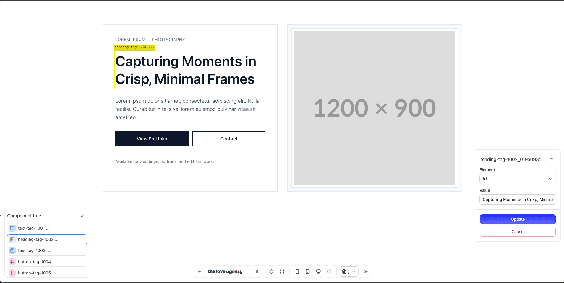
Here’s an example hero section using several Canopy elements:
{% block body %}
<section class="bg-white text-slate-900">
  <div class="mx-auto max-w-7xl px-6 lg:px-8 py-20">
    <div class="grid lg:grid-cols-2 gap-8 items-stretch">
      <!-- Left: Copy Block -->
      <div class="border-2 border-slate-200 p-8 md:p-10 flex flex-col gap-8">
        {{ cms_text('text-tag-1001', {
          value: 'Lorem Ipsum — Photography',
          class: 'uppercase tracking-wider text-xs md:text-sm text-slate-500'
        }) }}

        {{ cms_heading('heading-tag-1002', {
          element: 'h1',
          value: 'Capturing Moments in Crisp, Minimal Frames',
          class: 'text-3xl md:text-5xl font-semibold leading-tight'
        }) }}

        {{ cms_text('text-tag-1003', {
          value: 'Lorem ipsum dolor sit amet, consectetur adipiscing elit. Nulla facilisi. Curabitur in felis vel lorem euismod pulvinar vitae sit amet leo.',
          class: 'text-base md:text-lg text-slate-600 max-w-prose'
        }) }}

        <div class="grid grid-cols-1 sm:grid-cols-2 gap-3">
          {{ cms_button('button-tag-1004', {
            text: 'View Portfolio',
            url: '#portfolio',
            opens_new_tab: false,
            class: 'w-full inline-flex items-center justify-center bg-slate-900 text-white px-5 py-3 text-sm md:text-base font-medium hover:bg-slate-800 focus:outline-none focus:ring-2 focus:ring-slate-900 focus:ring-offset-2'
          }) }}

          {{ cms_button('button-tag-1005', {
            text: 'Contact',
            url: '#contact',
            opens_new_tab: false,
            class: 'w-full inline-flex items-center justify-center bg-white text-slate-900 border-2 border-slate-900 px-5 py-3 text-sm md:text-base font-medium hover:bg-slate-50 focus:outline-none focus:ring-2 focus:ring-slate-900 focus:ring-offset-2'
          }) }}
        </div>

        <div class="pt-2 border-t border-slate-200">
          {{ cms_text('text-tag-1006', {
            value: 'Available for weddings, portraits, and editorial work.',
            class: 'text-sm text-slate-500'
          }) }}
        </div>
      </div>

      <!-- Right: Visual Block -->
      <div class="border-2 border-slate-200 p-3 bg-slate-50 flex items-stretch">
        <div class="w-full border-2 border-slate-200 bg-white p-2 flex">
          {{ cms_image('image-tag-1007', {
            url: 'https://placehold.co/1200x900',
            alt_text: 'Lorem Ipsum Photography Hero Image',
            class: 'w-full h-[440px] md:h-[520px] object-cover'
          }) }}
        </div>
      </div>
    </div>
  </div>
</section>
{% endblock %}
This example defines editable text, headings, buttons, and an image block — all controllable through the Blutui dashboard.
Understand Canopy handles and attributes
Each Canopy element has a unique handle (for example: text-tag-1001) that identifies it on a specific page.
Along with the handle, you can define optional attributes such as:
value— Default text or fallback content.class— CSS classes for styling.element— HTML tag type (for headings, lists, etc.).url,alt_text,opens_new_tab, and more — depending on the element type.
When you edit a page in the dashboard, these handles map to fields in the Canopy editor for that page.
Supported Canopy elements
Here are the most commonly used Canopy elements:
cms_audiocms_buttoncms_codecms_headingcms_imagecms_listcms_quotecms_textcms_video
Summary
Canopy elements make your layouts editable and flexible, bridging your code with the Blutui dashboard. They’re ideal for unique, per-page content — while Collections are better suited for reusable or global data.
More resources
Last updated on